Author: alchemyst

  • The fallacy of infrequent measurements

    The fallacy of infrequent measurements

    Every now and again I will come across the reasoning that it is useless to measure a noisy signal frequently. My background as a control engineer tells me in fact a noisy signal should be sampled more frequently so that we can more accurately filter out the noise and in general more frequent sampling is better than less frequent sampling, all other things being equal.

    How often should I weigh myself?

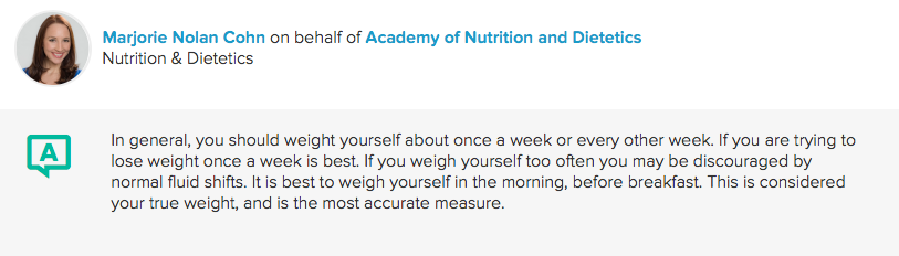
    Among non-engineers I see this idea often in reference to weighing yourself when trying to lose weight. The argument goes that your weight may fluctuate on a day-to-day basis, so you should measure every week (or even less frequently) to avoid getting discouraged, something like this answer to the question “How often should I weigh myself?” on sharecare.com:
    Of course, there are many psychological effects at play when you are trying to lose weight, but I’d like to focus on the statistical properties. Before I jump in though, I should mention that there are long-term studies which have found people who weighed themselves daily were more successful than weekly weighers at losing weight.

    I don’t have time for a long-term study so I will turn to simulation to figure out what to do.

    A weight loss experiment

    Let’s consider a weight loss target of 1 kg / week, the fastest weight loss rate recommended by the NHS. For the sake of this argument, let’s assume that we have taken the actions necessary to lose weight at this rate. My own experiments on weight have shown that my weight fluctuates approximately normally distributed with a standard deviation of 1 kg.

    If we use my typical weight as an example, that means the “true” weight looks something like this, along with some measurements which are assumed to have normally distributed errors with 1 kg standard deviation and zero mean:

    These measurements are telling – notice that the overall trend is clearly downward, but in this case I would have thought I had gained weight after 7 days, but been very happy to see a large loss over the next 7. Remember that stepping on the scale and not looking at the number is the same as not weighing at all in terms of measurement accuracy.

    So the question arises, given that we are losing weight as planned (1 kg / week) and that the noise in the measurement is as we have said above, what is the chance to see a higher weight on the scale after N days than on the initial day 0 weigh-in?

    If we are weighing only on day 0 and on day N, the answer is quite simple. The difference between two normal distributions is itself normally distributed with variance equal to the sum of the variances. This allows us to plot the chance of seeing a higher measurement N days after the first:
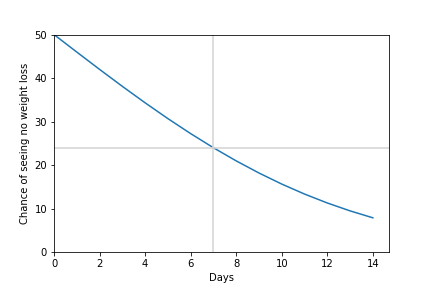
    So after 7 days, there is about 1 in 4 chance of seeing no improvement in our weight even if we are successfully losing 1 kg/week! Even after two weeks of weight loss there is still almost 10% chance that we will see a higher measurement. Surely there must be a better way.

    If we had measured every day and fit a line through the points, things would look a little different.

    Here is a graph showing fits on the first and second week’s data, along with an overall fit for the two weeks:
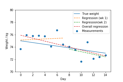
    This might not seem like much of an improvement, since we would still have called the first week a loss (or more accurately a gain!).

    But let’s analyse this systematically. Let’s assume we weigh every day and fit a curve. The important figure here is the slope of the line we fit. If the slope is negative (moving down), we are losing weight on average. If it is positive (moving up) we are gaining weight. How does this idea compare to the previous one? How likely are we to see “no improvement” in our weight after N days?

    Unfortunately we can’t get a formula for this, but I have done a Monte Carlo simulation where I have generated 50 000 possible weight measurements, fit a line and calculated the percentage of cases where the slope was positive. This is the result:

    The error rate of this method is significantly lower than the two-point method. So if we are indeed losing weight, this is a much better way to be sure.

    You can follow along with my calculations using this Jupyter Notebook.

    Take-home

    The results of this study shows clearly that it is better to measure more frequently in the specific case of verifying weight loss. This is however a general rule – the more frequently you sample a fluctuating signal, the more certain you can be about its general properties.
  • The user stance

    I recently read an old article by Joel Spolsky which is actually a review of The art of Unix Programming by Eric S Raymond. Its title, “Biculturalism” made me think immediately of The Two Cultures by CP Snow.

    Unix culture

    Joel is a developer who understands the Windows culture very well. He worked on Microsoft Excel and is one of the founders of Stack Overflow. He really understands the needs of users, but it also seems like he “gets” the Unix virtues. I have spent a long time absorbing these virtues, so it was refreshing to see a different take on it.
    In short, he says “Unix culture values code which is useful to other programmers, while Windows culture values code which is useful to non-programmers”. I have migrated away from Windows for this reason as I find myself on the programming side more than I find myself on the user side. Said differently I don’t program much for end-users.

    It’s a stance, not an identity

    I think the most important thing to understand about users is that the tools they are using are a means to an end not an end in themselves. The most successful tools allow users to feel like they are simply solving the problem themselves, with the tools fading away and just supporting the user. Even physical tools have this tendency to become extensions of our bodies.
    I won’t want to create the impression that I do not consider myself a user. When I want to get things done, I also value tools which allow me to get those things done with the minimum of effort and low cognitive load. It is, however, useful to distinguish between the user mindset, which I will call the user stance and the identity of a particular individual. It is more accurate to say someone is approaching a tool in the user stance than to say that a person is a user. This also makes it clear that the same person can approach different tasks differently.

    What is a stance?

    I’m borrowing the word stance here from Daniel Dennet’s three stances:

    • Physical stance – which makes predictions from some physical law or model of how the parts work (what is it made of/how is it put together)?
    • Design stance – predictions are made from knowledge of the purpose of the system (what is it designed to do)?
    • Intentional stance – predictions involve attributing intent to the system (what is it trying to do)?

    The design stance allows us to reason about the function of an object by knowing it is designed to solve a particular problem or behave in a particular way. This is what allows us to predict the position of a clock’s hands at a particular time of day.
    I would say that taking the user stance implies additionally supposes that the designer was good enough that the problem the tool was designed to solve will be easy to solve using this tool.
    I’ve spent lots of time reasoning about these stances during teaching, especially the overeager way in which people fall into the intentional stance when interacting with complicated systems like computer software. Even though software is basically a deterministic system, it is often easier for people to reason about its actions by ascribing intent: “The system is trying to do X, so it will try to do Y”.

    Misapplication

    The key insight that I had while reading Joel’s article has to do with noticing that the user stance can be adopted like a strategy. The article is pretty astute in recognizing that commercial software is mostly built in service of users. The goal is to remove friction in service of getting a job done. This leads to beautiful and intuitive user interfaces which can be picked up quickly. Most Windows (and Mac) programs are “interface first” – there will be a sketch of the interface before there is any actual functionality.
    I find my students (who were by now all born after Windows 95 came out) have signficant difficulty even imagining a computer program which doesn’t have a (graphical, on-screen) interface. Being “user-friendly” means rewarding people for adopting the user stance.
    I made the journey across the computing landscape coming from command-line interfaces and somehow I fell in love with them. There are plenty of people in my office who are as old or older than I am who jumped ship as soon as graphical interfaces became available. I suspect that this is because most of them approach the computer from the user stance.
    I think the user stance is inappropriate in a couple of settings, where it mostly leads to frustration:

    When you are trying to learn how something works

    An excellent way to find out how a thing works is to take something apart or try to build one yourself. I have learned a great deal by implementing computer programs which solve problems I have encountered in my life. A nice side-effect of this approach is that you end up building tools for yourself. I used to believe that making the source code of these tools available to my students would help them to see what they look like inside and understand them better. What I have found is that most of my students are stuck in the user stance – it is hard for them to see these notebooks as anything other than a tool for solving these particular problems. Even though the parts are exposed, they work even when you don’t understand them and if you are just trying to solve a problem, you don’t care how it works (this is a key part of the user stance).

    When you’re trying to build tools for tool-makers

    Developers or tool-makers have different needs from users. In many cases, they value modularity and re-usability above immediate usefulness. I’m not sure, but I think there may even be a correlation with the novice-expert spectrum here. When you watch cooking shows you find out that single-use tools (a single thing that only slices avocados for instance) are frowned upon by chefs in favour of multi-purpose tools which perhaps require more learning and skill but allow for broader application.
    This attitude spills over to tool creation when you try to build tools which do one thing well and can be used in multiple applications – just like the Unix tools. By contrast, graphical applications tend to be like the avocado slicer.

    When you’re trying to work collaboratively

    I have often made the mistake of building systems for what I had imagined would be a collaborative activity and made it too easy to adopt the user stance in designing the interface. My experience has been that as soon as the interface treats you like a user, you fall into the user stance. The symptoms of this is that people log a support call instead of fixing things, even when they have the power to do so. A specific failure has been building out our departmental wiki. Wikis are collaborative by nature, but strangely most of my colleagues are users of this resource. I’ve seen this even with Wikipedia. People are vaguely aware that they could edit the content, but they seldom do.

    Final word

    My exploration of this idea has led me to approach the way I design things differently. It has also allowed me to understand my own and other’s behaviour better as I now have words to distinguish between different strategies.

  • How to separate your data from your code

    The wrong way

    You’ve started writing some code which reads from data files, and does some expensive computation which is written to some different data files. Perhaps you’re doing this in a Jupyter notebook which contains the following cell:

    import pandas
    
    input_data = pandas.read_csv('input.csv')
    results_data = expensive_operation(input_data)
    results_data.to_csv('results.csv')


    Now, you want to put your code on GitHub, so you add Calculation.ipynb, input.csv and results.csv to the repository.

    The advantage of this method is that everything is in one place and so is easy to share with other people. If we weren’t using version control, this would be a reasonable method. However, there are some problems with this method when using version control to collaborate:

    • If the expensive_operation doesn’t produce exactly the same output every time, results.csv will change with every run of your code. This will clog up the change log with lots of meaningless changes.
    • If the expensive_operation produces large output files, your repository will also fill up with a large number of changes (remember tools like Git store all the versions of files)
    • If you use binary formats for these files, the version control tracking is less useful.

    For these reasons I believe both input data and output data should be kept separately from the code repository. I propose using a file syncing service like Dropbox, Google Drive, Box, etc to handle the task of managing and storing shared data.
    “But”, I can hear you ask, “why not have the code on one of these platforms as well?”. Well, because version control handles source code much better and uses delayed sync so that you can tell the system when your code is ready to be shared, while data files are usually edited with external programs and uploaded all at once.

    Every solution brings a new problem

    Different people have different paths

    So let’s say you’ve understood this, so you move those files into your Dropbox under a folder called “Data files”, which you can share with your colleagues. Now you need to rewrite your program to read from your Dropbox folder. Your first problem is finding the right filenames to put in to the code, which involves finding the path for the files. For Windows users the path to your folder may be C:UsersPeterDropboxData files. The C:UsersPeter part is called your “home directory” or “home folder” which we’ll get back to later. For Mac users this is /Users/Peter/Dropbox/Data files and for Linux users it’s often /home/Peter/Dropbox/Data files. Let’s assume you’re using windows, so you write the code as follows:

    import pandas
    
    input_data = pandas.read_csv(r'C:UsersPeterDropboxData filesinput.csv')
    results_data = expensive_operation(input_data)
    results_data.to_csv(r'C:UsersPeterDropboxData filesresults.csv')

    The r in front of those strings stands for “raw” and stops Python from interpreting the backslashes as escapes.
    The problem here is that every user has a different username, so we can no longer just download this code and run it. Furthermore, you will notice that the different operating systems have different conventions for which character separates the parts of paths (Windows uses , Unix-like OSs use /).

    Pathlib to the rescue

    Both of these problems (different user directories and different separators) can be solved with the pathlib library:

    import pathlib
    import pandas
    
    # find this user's Dropbox folder
    datadir = pathlib.Path('~/Dropbox').expanduser()
    
    input_data = pandas.read_csv(datadir / 'input.csv')
    results_data = expensive_operation(input_data)
    results_data.to_csv(datadir / 'results.csv')

    Pathlib allows us to expand the ~ character into the user directory correctly on every platform. It also allows us to use the division operator to join file parts correctly. The above code will run correctly on every major operating system and work for the default settings of Dropbox. Also notice how we didn’t repeat the same folder twice in the code.

    One size fits all?

    But of course, not everyone accepts the default settings. Also, what if you don’t use Dropbox, but some other service which syncs folders? How can we accommodate all the differences between people’s setups?
    The answer is local configuration. This requires a couple of things to be in place, but is actually quite easy. I’ll start with the improved code first:

    import configparser
    import pathlib
    import pandas
    
    config = configparser.ConfigParser()
    config.read('config.ini')
    
    datadir = pathlib.Path(config['paths']['datadir']).expanduser()
    
    input_data = pandas.read_csv(datadir / 'input.csv')
    results_data = expensive_operation(input_data)
    results_data.to_csv(datadir / 'results.csv')

    For this code to run, there needs to be a file called config.ini in the current directory when it runs. This file looks like follows:


    [paths]
    datadir=~/Dropbox

    “But”, I hear you say again, “aren’t we back to the same problem as before with local filenames?”. The answer is “No”. Because this filename is the same for all users of the code. It’s the contents of the file which changes per user. For this system to work, you need to avoid checking in the config.ini file into your repository (you can do this by adding it to .gitignore). And since you might want to use this configuration file in a lots of different places, I recommend creating a config.py module like this:

    import configparser
    import pathlib
    
    config = configparser.ConfigParser()
    config.read('config.ini')
    datadir = pathlib.Path(config['paths']['datadir']).expanduser()

    Now you can simply do this in the parts where you need to access your data:


    from config import datadir
    import pandas
    
    
    input_data = pandas.read_csv(datadir / 'input.csv')
    results_data = expensive_operation(input_data)
    results_data.to_csv(datadir / 'results.csv')

    It’s not just for data

    The cool thing about having this configuration file is that you can use it for any local configuration you need. Think about all the things that are in your code right now which should be local.

    Decide between user-local and directory local

    I’ve made a particular design choice in this solution which is to have the config file in the directory where the code is. It might suit your program better to have a configuration file in each user’s User directory or perhaps a global one. What I’ve presented here is already much better than hard-coding your paths, though.

    Late edit: It turns out that there is a nice package in PyPI which can help you to avoid writing your own config file reader. It’s called decouple.

  • Gautrain API reverse engineering

    Gautrain API reverse engineering

    The iOS 12 update contained a very cool feature: Siri Shortcuts. This replaces the Workflows app. I was using Workflows to send my wife an SMS with my estimated time of arrival at home when I left work. With the new Shortcuts app I could have this all happen automatically, and it also supports reading from Web APIs.
    The first part, however, is to figure out how to get data from the Gautrain website.

    mitmproxy

    mitmproxy or Man In The Middle Proxy is a piece of software you can run on your computer which will stand between a device and the internet and allow you to inspect what is going on. I might cover installation in another post, but basically I just followed instructions to get it going and then fired up the Gautrain app to see what it was doing.

    Sequence of events with Gautrain App

    First endpoint to check service is live

    https://api.gautrain.co.za/user-service/api/0/mobile/isLive/1.0.0

    Returns true or false.
    The app then hits

    https://api.gautrain.co.za/transport-api/api/0/agencies

    And gets a whole list of agencies, including this one:

    [
    ....
    {
            "culture": "en",
            "description": null,
            "href": "https://platform.whereismytransport.com/api/agencies/edObkk6o-0WN3tNZBLqKPg",
            "id": "edObkk6o-0WN3tNZBLqKPg",
            "name": "Gautrain"
    },
    ...
    ]

    The important part here is "name": "Gautrain" and that id which is used later.
    Also interesting is that they are clearly using whereismytransport.com, which is the first time I’ve heard of this service.
    The app then asks ask for a list of stops:

    https://api.gautrain.co.za/transport-api/api/0/stops/gautrain

    The response is a list of stops like this one:

    [
    ...
    {
        "agency": {
            "culture": "en",
            "description": null,
            "href": "https://platform.whereismytransport.com/api/agencies/edObkk6o-0WN3tNZBLqKPg",
            "id": "edObkk6o-0WN3tNZBLqKPg",
            "name": "Gautrain"
        },
        "code": null,
        "geometry": {
            "coordinates": [
                28.23794,
                -25.74762
            ],
            "type": "Point"
        },
        "href": "https://platform.whereismytransport.com/api/stops/_rkqSHvRE0Scvbcsuy0EVw",
        "id": "_rkqSHvRE0Scvbcsuy0EVw",
        "modes": [
            "Rail",
            "Bus"
        ],
        "name": "Hatfield"
    },
    ...
        {
        "agency": {
            "culture": "en",
            "description": null,
            "href": "https://platform.whereismytransport.com/api/agencies/edObkk6o-0WN3tNZBLqKPg",
            "id": "edObkk6o-0WN3tNZBLqKPg",
            "name": "Gautrain"
        },
        "code": null,
        "geometry": {
            "coordinates": [
                28.05693,
                -26.10858
            ],
            "type": "Point"
        },
        "href": "https://platform.whereismytransport.com/api/stops/jXU-OlvxukW8wfc7JeVeXw",
        "id": "jXU-OlvxukW8wfc7JeVeXw",
        "modes": [
            "Rail",
            "Bus"
        ],
        "name": "Sandton"
    }
    ...
    ]

    I’ve kept the important ones for me – I’m going from Hatfield to Sandton and back, so I need those coordinates.
    Right, so the next thing they hit is

    https://api.gautrain.co.za/transport-api/api/0/journey/create

    This is the first request which has parameters. You can see that they are using the coordinates for Hatfield station and Sandton station as the start and end points.

    {
        "geometry": {
            "coordinates": [
                [
                    28.23794,
                    -25.74762
                ],
                [
                    28.05693,
                    -26.10858
                ]
            ],
            "type": "MultiPoint"
        },
        "maxItineraries": 5,
        "omit": {
            "agencies": [
                "A1JHSPIg_kWV5XRHIepCLw",
                "CA3o3RuuGUmoDKfyAPNTsg",
                "NfBxKfzMA0exbwToc-7o2g",
                "XxDwxnin_Eu_T7_wBJIJRA",
                "Hwe1673sC0yuT6fyANnDZQ",
                "DcXaTl-5hkGRHKenAIi_5w",
                "WaasqFZwEEa5VqbIAJKsJQ",
                "wZfSY3o0LUGHiqeoAQDeIQ",
                "W7A63uTwIECgQvU9MxcCIw",
                "Ka2d4V1g3E65VqheANhvVw",
                "FTGTH38Tm0C5O6gAAQifSQ"
            ],
            "modes": []
        },
        "only": {
            "agencies": [
                "edObkk6o-0WN3tNZBLqKPg"
            ],
            "modes": []
        },
        "profile": "ClosestToTime",
        "time": null,
        "timeType": "DepartAfter"
    }

    So that list of agencies to omit is obviously from the original request. I’m hoping I don’t need that. For my purposes I just need to know when the next train will arrive and how long it will take to get to the destination.
    The response from this request is quite huge, but the first bit shows the important parts:

    {
        "agencies": null,
        "earliestDepartureTime": null,
        "geometry": {
            "coordinates": [
                [
                    28.23794,
                    -25.74762
                ],
                [
                    28.05693,
                    -26.10858
                ]
            ],
            "type": "MultiPoint"
        },
        "href": "https://platform.whereismytransport.com/api/journeys/ZPtEXRtgeEq1mqljAE4new",
        "id": "ZPtEXRtgeEq1mqljAE4new",
        "itineraries": [
            {
                "arrivalTime": "2018-09-22T05:29:52Z",
                "departureTime": "2018-09-22T04:56:20Z",
                "distance": {
                    "unit": "m",
                    "value": 51662
                },
                "duration": 2012,
        ...
        Lots more output

    So when is the next train?

    I’m only really interested in when the next train will arrive at Sandton and I don’t want to type all that stuff into a mobile app, I want a minimal version.

     Further investigation yields the simplified request:

    {"geometry":
     {"coordinates":
      [[28.23794,-25.74762],
      [28.05693,-26.10858]],
      "type":"MultiPoint"},
      "profile":"ClosestToTime",
      "maxItineraries"5,
      "timeType":"DepartAfter",
      "time":null,
      "only":{"agencies":["edObkk6o-0WN3tNZBLqKPg"],
      "modes":[]}}

    This is something I can put into the automation app eally easily. More info on that to follow.
    For posterity, this is that call being checked via curl:

    curl -d '{"geometry":{"coordinates":[[28.23794,-25.74762],[28.05693,-26.10858]],"type":"MultiPoint"},"profile":"ClosestToTime","maxItineraries":5,"timeType":"DepartAfter","only":{"agencies":["edObkk6o-0WN3tNZBLqKPg"]}}' -H "Content-Type: application/json" -X POST https://api.gautrain.co.za/transport-api/api/0/journey/create

    Guess it’s also time to create an account at whereismytransport.com!

  • Case study: R (tidyverse) vs Python (pandas)

    Case study: R (tidyverse) vs Python (pandas)

    The problem

    An old friend e-mailed me a challenge today. He was working with a data file which contains measurements of compounds from groundwater taps. The file looks like this (when opened in a spreadsheet program):

    In other words, it contains measurements for a particular date for a particular tap point and compound.

    He was using the following R code to plot how the Iron levels varied over time at different sampling points:

    library(tidyverse)
    
    ggplot(data) +
      geom_line(mapping = aes(x=Date,y=Tap4.Fe,color="red")) +
      geom_line(mapping = aes(x=Date,y=Tap5.Fe,color="blue")) +
      geom_line(mapping = aes(x=Date,y=Tap6.Fe,color="purple")) +
      geom_line(mapping = aes(x=Date,y=Tap7.Fe,color="green")) +
      geom_line(mapping = aes(x=Date,y=Tap8.Fe,color="orange")) +
      geom_line(mapping = aes(x=Date,y=Tap9.Fe,color="brown"))


    But he could sense that this was not an optimal solution to the problem and wanted some advice on getting this to work better.

    Tidy data

    My first comment to him was that this data is not in the format which the tidyverse wants. Hadley Wickham appears to have revitalised the R language with his clever packages and wrote a manifesto of sorts to the benefits of tidy data, which I feel is really just a no-nonsense approach to data normalisation. There are many things wrong with the data in its current form, but I see spreadsheets like this quite often.
    The problem is that people want an easy way of entering data and often end up focusing on ease of entry instead of ease of analysis. It is easy to understand how this format grows by adding more readings as extra columns on the spreadsheet and having one date per row. 
    From a normalisation perspective, the problems with this format are that there is data in the column name: Tap4.Fe is actually encoding two fields – a position and a compound. Our first job is therefore to tidy up this data.
    The tidyverse supplies a lot of useful functions to do just that. Here is how I tidied the data:
    measurements %
      gather(measurement, value, -Date) %>% 
      separate(measurement, c(“position”, “compound”), sep=”\.”) %>%
      drop_na()
    Now measurements is much “taller” and less wide:

    The key points here are that we have a single row for a single observation. This is the essence of the tidy data philosophy and it makes downstream processing very easy.

    Here is how I recreated his plots:

    filter(measurements, compound == “Fe”) %>% 
      ggplot + 
      aes(x = Date, y = value, color = position) + geom_line()

    That’s really nice. I can filter to find the Iron measurements and I can have ggplot handle the colours automatically by looking at the position.

    The resulting plot looks like this (this is just with all default settings):

    Python

    I was very happy with how succinct the R version of the solution was, but I use Python more than R, so I was interested to see how Pandas handles this.
    The “tidyfication” of the data requires a lot more ceremony in Pandas:
    df = (pandas.read_csv(‘data.csv’, parse_dates=[‘Date’])
          .melt(id_vars=’Date’)
          .dropna())
    df[[‘position’, ‘compound’]] = df.variable.str.split(‘.’, expand=True)
    del df[‘variable’]
    I’m especially critical of how hard it is to replace a compound column with its split version (the last two lines). Wickham clearly understands that this is a common problem in data files, where the Pandas version feels “hacky”.
    Now the code to recreate the graphics:
    df.query(‘compound==”Fe”‘).pivot(index=’Date’, columns=’position’, values=’value’).plot()
    Again, I am using the default settings. Although that might look a bit simpler than the R code, it took me ages to write. There is a bit of counter-intuitive (to my mind) pivoting so that I can use the built-in Pandas plot command and I have much less flexibility about the mapping.
    I suppose the take-home here is that tidying your data is a win regardless of your platform, but that R and the tidyverse is really a force to be reckoned with. I’m hoping the Pandas API will end up providing some of the powerful verbs from tidyr et al eventually.