Author: alchemyst

  • Numpy matrices work for general objects

    A student was having difficulty using a class I had created to represent transfer function objects. I discovered that they were actually placing these objects in a numpy.matrix and trying to multiply things by one another. To my surprise, this actually worked! I had to investigate. The code here is all in Python.

    I created a quick tracing object which just kind of logs the operations that are done on it as an expression:

    class operation:
        def __init__(self, name):
            self.string = name
        def __repr__(self):
            return self.string
        def __str__(self):
            return self.string
        def __add__(self, other):
            return operation("({} + {})".format(str(self), str(other)))
        def __mul__(self, other):
            return operation("{}*{}".format(str(self), str(other)))
        def __radd__(self, other):
            return operation("({} + {})".format(str(other), str(self)))
        def __rmul__(self, other):
            return operation("{}*{}".format(str(other), str(self)))
           
    
    Now I can do some interesting stuff:
        In []: a*b
        Out[]: a*b
        In []: a + b
        Out[]: (a + b)
    
    Ok, but what about matrix multiplication?
    import numpy as np
    In []: tracer = np.matrix([[a, b, c],
    [d, e, f],
    [g, h, i]])
    
    In []: tracer*tracer
    Out[]:
    matrix([[((a*a + b*d) + c*g), ((a*b + b*e) + c*h), ((a*c + b*f) + c*i)],
            [((d*a + e*d) + f*g), ((d*b + e*e) + f*h), ((d*c + e*f) + f*i)],
            [((g*a + h*d) + i*g), ((g*b + h*e) + i*h), ((g*c + h*f) + i*i)]], dtype=object)
    
    That kind of blew me away! It means I can probably get away with a whole lot less code than I thought I would need to implement my own matrix-like objects.
    In addition, it appears that some numpy functions will attempt to call corresponding functions in the object they act on:
        In []: np.exp(a)
    ---------------------------------------------------------------------------
    
    AttributeError                            Traceback (most recent call last)
     in ()
    ----> 1 np.exp(a)
    AttributeError: exp
    
    This error shows that np.exp is trying to access the exp attribute on this object. Let’s extend our object with an exp method like this:
        def exp(self):
            return operation("e^({})".format(self))
    
    Now (after re-instantiating a-i from above), we have
    In []: np.exp(a)
    Out[]: e^(a)
    
    This is going to be super useful.
  • Understanding electricity terminology

    With the recent bout of load shedding, everyone’s been writing about electricity. The problem is that many people get things wrong, or apply conventions which are less useful than they think.

    The basics

    Electricity is fundamentally about the flow of electrons. You may say that it is also about magnetic fields, but most of the terminology you’ll be seeing in the articles about load shedding is about making electrons move. Now, electrons are very small, so it makes sense to count them in big groups rather than individually. In the SI system, the coulomb (C) is defined as exactly 6.241×10¹⁸ electrons. You can think of this as equivalent to something like a truckload of coal. Since every material we work with has many electrons already, just having them is not particularly useful. Electrons can do useful things when they are in motion. When there is a flow of electrons in a conductor, this is referred to as current and measured in ampere (A). 1 A = 1 C/s, although technically the ampere is the base unit and the coulomb is the derived unit in SI, so 1 C = 1 A⋅s . To continue our analogy, if coulomb is like “truckloads”, ampere would be “truckloads per day”.

    Flowing electrons can be harnessed to do work in the same way that a flowing river can be harnessed. The rate at which they can do work is related not only to how fast they are flowing (the current) but also to the potential difference (measured in volts, V) between the end points. In a river, this would be the pressure. Work is measured in joules (J), which is also the unit of energy. The rate at which work is done (also called the power) is measured in watt (W). 1 W = 1 J/s. For a constant current (DC), the power is the product of the current and the potential difference. This means that 1 W = 1 V⋅A. This is approximately true for power supplied by batteries. For a thoroughly mixed metaphorical space, let’s say that energy (J) is like a distance and power (W) is like a speed.

    It gets a little more complicated if the current is not constant. The kind of electricity Eskom supplies is sinusoidally varying (AC), which means that we need to distinguish the “apparent power” and the “real power”. This Wikipedia page is a pretty good resource for this idea. The calculation doesn’t change the units in SI, although there are conventions which I will discuss a bit later.

    In terms of the load shedding, W is the unit that will be used to talk about the amount of load to be shed. Load in this context is the same as power.

    Orders of magnitude

    Some of the SI units discussed above are not sized reasonably for everyday use. For instance, a 100 W lightbulb burning for one day will consume 8 640 000 J of energy. For this reason the SI has prefixes for different orders of magnitude. I can choose to express the energy consumed by that lightbulb as 8.64 MJ to save space. It’s anyone’s guess why the load shedding limits are reported in MW rather than GW. Why say 1000 MW when you could have said 1 GW?

    The problem of time

    In the discussion above, I have restricted myself to the SI system. The SI unit of time is the second (s), and all the units which reference time are built using the second. Time calculations are tricky, because of the fact that there are 60 seconds in a minute and 60 minutes in an hour. Those factors aren’t powers of 10, so they don’t fit smoothly into the decimal system that SI uses. This means that in various industries, the quantities discussed above have been measured using different time units. For instance, your electricity bill probably specifies your electricity usage using the “kWh”, which is the energy used by a 1 kW device operating for 1 hour. Notice that this is the same dimensional combination as the joule. 1 kWh = 1 kW⋅h and 1 J = 1 W⋅s. In fact, 1 kWh = 3.6 GJ, so there’s no real nead for the kWh, even in terms of easy magnitudes. The real difference boils down to the difficulties of manipulating factors of 60.

    When measuring the storage capacity of batteries, one will mostly see A⋅h being used rather than the dimensionally-similar C. Smallish batteries like AAs typically have capacity of around 10 kC (meaning that this is the number of electrons they can push around a circuit), but you are more likely to see that reported as 3000 mAh. I believe this is again due to the problems of time calculation, as there shouldn’t be much other difference between using A⋅h instead of A⋅s.

    The kWh is such a popular unit of energy that it is even used for derived rates. People will report the average energy production of  the Jasper solar facility as 180 000 MW-hours annually rather than saying that it will produce 648 TJ per year or produce at a rate of 20.5 MW on average over a year

    Conventions

    There are people reading this who will object viscerally to the calculation above, especially if they have been in the electricity industry. There are certain conventions regarding units which are widespread but don’t really make much sense from a dimensional point of view. One of them is that electrical energy is measured primarily in the kWh family of units, while the joule is restricted to other forms of energy. They would say that it is not proper to report the energy production of that solar plant in TJ as that sounds more like the energy supplied by fuel.

    Similarly, if you refer to the discussion about power calculations for time-varying current, there are people who insist on saying V⋅A is different from W rather than saying apparent power is different from real power and using W for both.

    Peaks and averages

    The last confusing thing about talking of energy is in being clear about peaks and averages. To continue the car analogy, it is pretty clear when someone says that they will travel 100 km in 1 hour that they will average 100 km/h but that they probably spent some of the time above that speed and may even have hit 160 km/h at some point. Remembering that the distance is like energy and that speed is like power, we can say that the 774 PJ of energy SA used in 2010 according to Wolfram Alpha means that we averaged 24.5 GW for that year. Why do we have a problem if Eskom has around 41 GW of generating capacity? For one thing, not all that capacity is on line at once. Due to various factors Eskom only has about 24 GW of generating capacity on line right now. Of course, the other problem is that peak demand is more than average demand. The load shedding of 4 November 2014 happened on a day where there was 28 GW of demand, leaving Eskom 4 GW short.

    While I’m on this topic, let’s also explain the somewhat confusing fact that the Jasper solar energy plant I linked to earlier reports “Size: 96 MW-DC installed capacity; 75 MW-AC net generation, Electricity Production: approximately 180,000 MW-hours annually”. We translated that last number to 20.5 MW. So what’s happening between the 96 MW and the 20 MW? The 96 MW is what the panels will produce when they have 1 MW/m² of solar irradiation. In SA, we have more like 1.2 MW/m², so they’ll see more than that at peak production. This is a bit like the maximum speed in the book that came with your car. Often you can get better than that if you run at the coast or use better fuel than they tested with. The 75 MW is pretty clear, that’s the amount of AC power they will deliver under the same conditions as the 96 MW was calculated. This includes the use of the station of its own power and conversion losses. Of course, the sun is only available part of the day, and the light is not as strong for the whole day either. There is also maintenance and other stoppages, which cuts the effective rate of production down to the 20 MW number. This final number divided by the “nameplate capacity” of 96 MW is known as the capacity factor, and 20 % is about par for the course for solar.

    Wrap-up

    So there you have it – this should enable you to decipher the different terms used in articles talking about electrical energy (and perhaps to do some research about that battery backup for your power at home). My last word on the matter is that you should be on the lookout for common misperceptions about units, like that kWh for some reason means kW/h instead of kW⋅h. Hopefully the discussion above will show you why kW/h doesn’t make any kind of sense.

  • One day software bootcamp for engineers

    Last week I spent a day going over the basics of the Unix shell, version control using git and some Python with engineering students. Here are some of the things I said, links to interesting tools and my insights from crowd feedback.

    Motivation

    Every year, new project students arrive on campus and are asked to do larger projects than they are used to. The methods they have used for data processing up to now are usually not up to the task. The ubiquity of the spreadsheet means that most of them have opened their files in a spreadsheet and then manually applied whatever operations they needed. In my fourth year projects and also at postgraduate level, the problems of scale mean that this method probably won’t work.

    I’ve been inspired by the people from Software Carpentry to set up a longish session where I help students to install the software they need and start to understand the power of the tools. The goal is to get them over the initial stage where you don’t know anything to a place where they can search for the answer themselves. I don’t have permission from the Software Carpentry guys to call this one of their events, and I only loosely based my session on theirs. They appear to have more of a life-sciences focus, whereas I tried to use engineering-type data in my session.

    I also chose to do this in Windows, but to use a Unix shell in order to ease the transition for those who would end up using Linux for their simulation. It doesn’t make sense to throw someone into the deep end here. It’s better to feel like you can do something at the end of a session than being made to feel powerless.

    Installers

    I chose the following installers for the session:
    • The Windows version of git. This is a good start as it includes git-bash, which also has a great subset of the unix tools.
    • The Python(x,y) distribution of Python. There are newer distributions around, but this one is still up to date and very user-friendly. If you are going to be doing science in Python, you need a distribution like this, as the batteries-included philosophy of Python doesn’t extend to science (yet).

    Unix shell

    I start with a review of where Unix comes from. As an aside, I highly recommend In the beginning… was the commandline for a pep-talk about how awesome the command line is as well as the most complimentary description of Emacs I have ever read. It helps to keep a picture of a teletype in mind when working on the terminal as it informs many of the design decisions.
    Now that everyone is in line-by-line mode, we can start the installer. The first two screens provide talking points about the differences between the terminal and the shell, as well as a profitable digression on the problem of different end-of-line conventions.
    After running the git installer, you have access to git bash, which you can start from the start menu. 
    Of course, we start with ls, and explain the idea of flags as well as the concept of a working directory (pwd and cd are introduced here, as well as . and ..). Then I move on to other commands, including echo, which allows me to explain how blobbing is handled by the shell rather than by each command we will be using. Most of this part is just me showing how useful the shell can be, with examples motivating cat, cut, grep, head, wc and some others. As the examples spin out, we start to use redirection and piping. I think it is more important to leave with a sense of awe at the possibilities, as well as some basic understanding of what to search for than any real expertise in the command line. It may also be useful to go through the Software Carpentry shell lessons.

    Version control

    Now that everyone is roughly comfortable with the command line, it’s time to start using git bash for what it’s named for: git.
    I’m not going to recapitulate the whole lesson here, especially because it’s better written up at Software Carpentry but the core is instilling a good set of nomenclature built around pictures which represent the structures git uses. First, here is how the repository commands work:
    Figure showing the parts of a git repository, with commands to move between them
    So this takes us up to basic commits. Now, we need to think about how commits relate to one another and how branching works. I use a visualisation similar to what GitHub uses, with dots for commits and arrow-boxes for branches.
    If you’re reading this to learn git, I recommend that you do the git code school for the basics and then work through the challenges on Learn Git Branching, which will give you a way to think about how branching and commit chains work:
    This interactive branching game is a great way to learn about git branching.

    Python for Octave/Matlab users

    All of the students in the session had learned programming in their undergraduate course, but most of them had learned Octave. This means that basic ideas from programming are already understood, but that the differences between Octave and Python are more important, because they may be working with a different mental model.
    I started with the way names work in Python, explaining the idea that Python variables shouldn’t be thought of as containers, as they are in Octave, but rather like labels. I did some of the stuff interactively, but if you’re reading this now, you only really need this article, which explains it with some great visuals. I can also highly recommend the Online Python Tutor site which allows you to generate these kinds of diagrams for running code and see each step. Here’s what that looks like for one of the examples in the article
    I also covered some tips on looping, mentioning the excellent Loop like a Native talk.

    Once these gotchas were covered, I also switched from the IPython terminal to the IPython Notebook. I gave a brief overview of how everything works and also mentioned that they need to study up on all the interesting magics.

    Then it was time to pack up!

    I can see why the SC guys do this as a two-day workshop, and I think if I do this again I will encourage students to bring files from their particular projects so that they can do some actual work rather than just examples. It’s always more meaningful to learn on a problem you actually want to solve than on some contrived example.

  • Managing scientific data and interchange with industry

    I spoke at a recent symposium on the difficulties in managing data interchange with industry.

    Just for some context, “industry” here stands for personnel involved in process control and modelling activities. My direct experience is in the petrochemical, mining and paper and pulp industries. I also show an example of data from a piece of analytical equipment.

    I’ve uploaded the source on GitHub here, and you can see the notebook without downloading it by using NBViewer.

    I’ve spoken about the pattern of intermediates on this blog before (in a slightly different context).

    Notably absent from this discussion are any kind of database, since my experience is that if you can’t e-mail it, it might as well not exist when talking to the kinds of people I work with. I’ve used sqlite quite extensively myself, but I have found most people want something they can double-click and just have it work.

    If you have different experiences, I’m always eager to learn. I am specifically interested in how people who use client-server databases for their data handle the problem of interchange.

  • Public transport in SA is not user-friendly enough

    I use public transport almost every day to get to and from work. I am a very happy user of the Gautrain train system. This causes some interesting problems and makes my life much harder than it should be when I have to go anywhere other than between my home and work.

    The Gautrain website is relatively informative about where the bus stops are and where the associated Gautrain buses go. The routes are presented in one interactive map on their website. I would have preferred if these routes were added to the Google Maps interface, because planning a trip means having two maps open – one view to the Google Maps interface so that I can search for the place I want to go and another view tediously synced to that one so that I can see if there is a bus near where I want to go. Sadly, this is the most user friendly public transport system I can use in my country. Here are some significantly more difficult-to-use alternatives.

    Tshwane bus

    I work at the University of Pretoria. Because I take the train to work most days, I don’t have access to a car when I am there. This means I have often tried to figure out how the Tshwane bus system works. Unfortunately I have never successfully planned a trip using this system as their timetables are completely opaque to me. The timetables are online, but the routes are simply listed in “Alphabetical order” and “Clockwise order” using the names of the routes. It appears that the routes are mostly concerned with going in and out of the CBD from the named suburb. Now, I lived in Brooklyn for five years, so let’s have a look at the Brooklyn route:

    BROOKLYN (10) 


    ROUTE OUT
    : From Thabo Sehume (Andries) between Pretorius & Francis Baard (Schoeman). Drive along Thabo Sehume, left along Jeff Masemola (Jacob Maré), Rissik, Justice Mahomed (Walker, Charles), Atterbury, Lois, Garsfontein, Corobay, Tucker, Gina, Corobay, Garsfontein, Anton van Wouw, Beethoven, Chopin, Duvernoy (Terminus). 


    ROUTE IN
    : Via Duvernoy, Lilken, Rover, Rudolf, De Klerk, Hermina, Rudolf, Rover, Beval, Coert Steynberg, Hugh McKinnel, John Scott, Issie Smuts, Duvernoy, Chopin,Beethoven, Anton van Wouw, Garsfontein, Corobay, Tucker, Gina, Corobay, Garsfontein, further the same in an opposite direction as far as cnr. of Justice Mahomed (Walker) & Bourke, via Justice Mahomed (Walker), Scheiding, Bosman, to City.

    I challenge anyone to use this without a pretty detailed street map in their hands. Doesn’t it make more sense to present this information in map form? Of course it does, that’s why this website exists, where a couple of people have taken it on themselves to get this information in map form, like this:

    Brooklyn 10 in graphical form

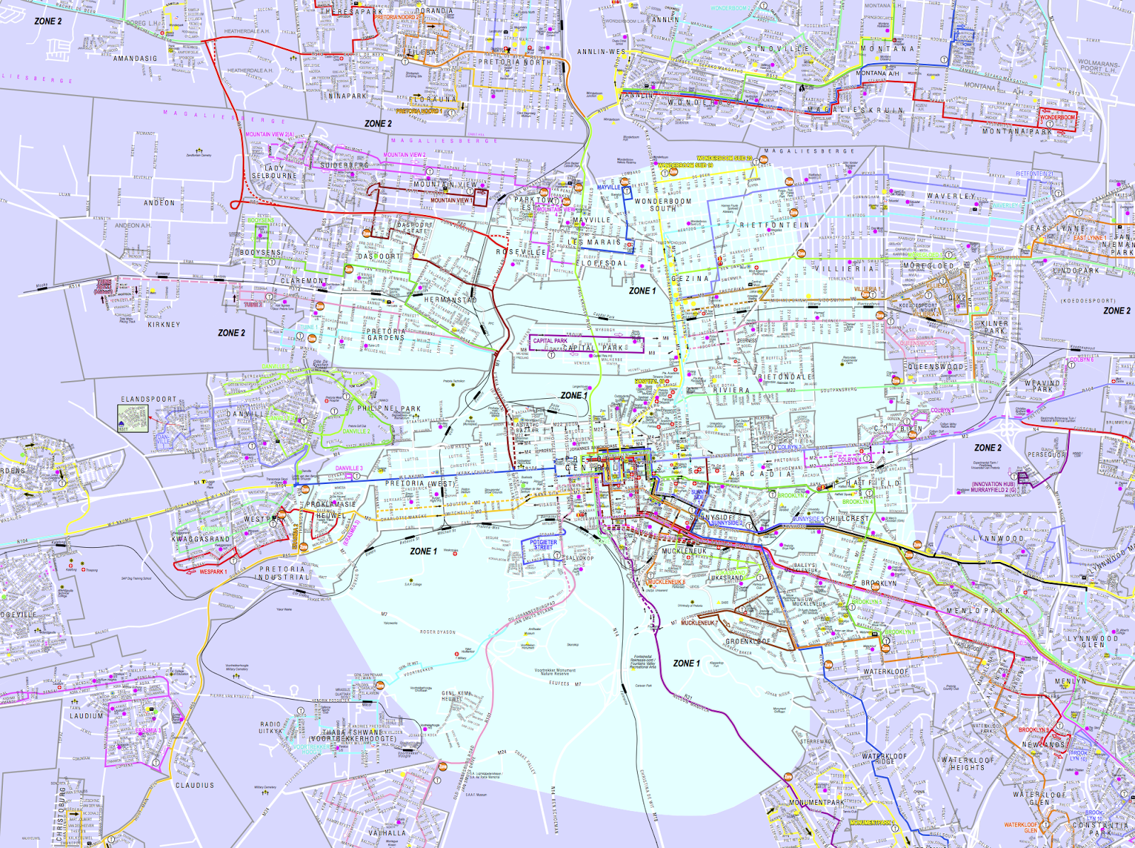
    Isn’t that much easier to understand? That website also allows you to add and remove a variety of routes so you can see which ones intersect and so on. Good stuff. Unfortunately it doesn’t show the location of the stops, nor does it assist you in route planning, so I can’t see how to get from the Groenkloof Nature reserve to the Menlyn Park Shopping centre in an easy way. In their defence, it does seem as though Tshwane have gone to the trouble of building a complete map of the bus system as one massive PDF which is designed to be printed out on A0 paper. Because most of us have an A0 printer hanging about. The big PDF does show you how poorly the bus system is designed to get around town rather than just go from your suburb to the CBD and back – there are almost no buses connecting around Pretoria, all just spokes emanating from the CBD hub:
    The hub-and-spoke Tshwane bus system
    So, this is not a good system for me to use to get where I want to go. I suppose I should be using taxis, but I’m a big fan of planning my route, so I’m not that comfortable with the idea of going to the taxi rank and asking around to find out which taxi will take me where I want to go.
    Another hope is the new Tshwane Bus Rapid Transit system, A Re Yeng. Right now that website doesn’t contain much information, but at leas the proposal document contains maps of the routes.

    Johannesburg

    The event that prompted this post was me trying to work out if I could get from Pretoria to the University of Johannesburg Kingsway Campus using public transport. I knew I could easily get to Gautrain Park station, but how to get West from there? I had seen a BRT station outside of the UJ campus, so I though I would be able to take that. The Johannesburg system is called Rea Vaya. I went to their website and was initially pleasantly surprised. They have maps of their routes! Unfortunately the interactive map appeared to show that there wasn’t a Rea Vaya route that went to the Kingsway campus, only a Joburg Metro bus, which wasn’t running at the times I needed to get to my destination. Luckily, I Googled around and found this brochure which has a more up-to-date map and mentions UJ Kingsway Campus as a stop on the T3 line. Armed with this knowledge I was able to find the T3 route “map”:
    The T3 Rea Vaya “Map”
    This is worth almost less than the Tshwane bus route descriptions as it is not searchable (being an image) and it gives no indication of direction. This kind of description is useful on the bus as it gives you a sense of how many stops you need to wait before you get off. It is useless off the bus or when planning routes, as it doesn’t allow for any kind of discovery of the information.
    An interesting extra point is that the website makes it very clear that you need a smart card to use the Rea Vaya bus. The page about smart cards proclaims “If you don’t have a smart card yet, you can get one – for free – from any of the five Rea Vaya customer care centres.” Of course, the exact location of these customer care centres is left as a delightful treasure hunt for the user. They aren’t indicated on any of the maps I found on the website. In fact, the only mention of customer care centres I could find was in the above mentioned brochure where they list the following six customer care centres:
    1. Carlton Centre East Rea Vaya Station (CBD)
    2. Johannesburg Art Gallery Station (Joubert Park)
    3. Orlando Police Station (Orlando)
    4. UJ Sophiatown Station (Melville)
    5. Indingiliza Terminus (Dobsonville)
    6. Bosmont Station (Bosmont)
    Clearly this system is targeted at people who already know the Johannesburg area intimately. How would a traveller coming from overseas, landing in OR Thambo and then proceeding using the Gautrain to Park Station obtain a Rea Vaya smart card? I suppose they would need to find each of these locations on their map and then perhaps walk there.

    Update: For future reference, I have determined that the Johannesburg Art Gallery station (number 2 in the list above) is the Rea Vaya customer service centre closest to the Gautrain Park station, by using this interactive map. It must be said that you still need to do way too much work to get to this information.

    When I tweeted @ReaVayaBus to seek help (“If I arrive at Park station on @TheGautrain, but I have not yet bought a smart card, can I buy a smart card there?”) , I got the noncomittal reply “You can get you Rea Vaya Smartcardat any Rea Vaya customere care Centre”. Because “You can get a smartcard at the Johannesburg Art Gallery station, 10 minutes walk from Park Station” would make it too easy.

    I’m not even going to start with the analysis of the Johannesburg Metrobus system as their routes are even more difficult to ascertain that the Twshwane ones.

    How it could (should) be

    Compared to my recent experience navigating through Barcelona, a city where I don’t even understand the language of most of the people or signs, public transport in SA is a nightmare. In Barcelona, I could use Google Maps on my phone to navigate to a place by simply typing its name into my phone. I was routed along the nearest set of public transport services completely automatically. I didn’t have to worry about finding stuff at all. In fact, the Gautrain has at least been incorporated into Google Maps, but the bus systems have not yet been, so I can get close but not really all the way. The Google Maps transit system is amazing. I can route and plan my journey with amazing ease, taking the times of the trains into account properly and it would allow me to figure out my cross-overs to the bus, but of course, that information is not on Google right now. If I were involved in the Johannesburg or Tshwane transport system I would be trying as hard as I could to work with them to get the information on their systems. This would be a thousand times better than trying to develop a system themselves.
    All route planning should be like this
    Now I suppose I’ve spent far too much time ranting about this, but I felt like I should at least get something out of all the time I’ve spent on these websites. My final decision was to take the car.